

All credit for the original template and workbook goes to Kevin Wee. Also shout out to Andy Kriebel for the original how-to method.
Andy Kriebel Post: How to Create a Ternary Graph | Tableau Public
Kevin Wee Template: Great Divide on Societal Acceptance of Homosexuality | Tableau Public
Prep Template Build Video: Ternary Plot Tableau Prep Template: Put Some Prep in Your Step - YouTube
Last week, Kevin Wee posted an incredible visualization as a submission to the Back 2 Viz Basics community initiative. Here's a screen shot of the viz:

Kevin really wanted to tackle this with a Ternary plot, and since they can require a bit of studying to fully understand, the viz puts all of the attention on that chart. As noted in his original post, this took quite a bit of data prep, especially because of the reference lines included. Luckily for us, he sent over a copy of the data set and allowed me to jump in to create a Tableau Prep template and even added a Template tab to his dashboard so you can create your own!
If you're wondering how this all works inside of Tableau Desktop, Andy Kriebel details this in a video on his YouTube channel: How to Create a Ternary Graph - YouTube
If you've been following this series, you know that's the purpose for these Tableau Prep templates. If you are new, then this is the high-level summary:
There are plenty of workbook templates with pre-built calculations for visualizations that aren't out-of-the-box in Tableau. Most of those templates require the data to be structured or pre-aggregated a very specific way. This template, as well as the other Prep templates, are to help you take your real-world data, plug it in, and get it in the correct structure to easily plug in to some workbook templates.
Because we're going to use the Pivot step in this template, we it actually comes in a few parts. There are 3 downloads: 1. Initial Steps:

2. Rightside Up Steps if you want your viz to look like this:

:

3. Upside Down Steps if you want your viz to look like this:


You can find the Prep flow and the Sample - Superstore data set (if needed for demo purposes) here: Ternary Plot - Google Drive
The Data The Superstore data set is my favorite to work with because it's such a good example structure to work with. The key here is to understand what Kevin did with his original data set.
The main concept used to form the triangle is this:

Kevin had 3 metrics to visualize. Should, Should Not, and No Answer. Each of these were percentages that added up to 100 in each row. The X and Y coordinates are then determined with the following calculations: X = 0.5*(2*D2+E2)/(C2+D2+E2)
Y = -1/2*SQRT(3)*E2/(C2+D2+E2)
The Y coordinate is using -1/2 to turn the triangle upside down. In the rightside up portion of the Prep flow, we use positive 1/2.
Kevin cleaned this up and applied it to his data, ending up with this:

Because there are 3 reference lines for each point in the triangle, we need to create 3 lines for each metric in our data set. If you want to see how this all comes together in Prep, be sure to check out the build video. For now, let's start plugging our data into the template!
Prep Flow
We're going to start with the Initial Steps flow. Connect your data and drag your table to the Keep Only step.

We need to identify our Dimension (what each point on the ternary plot should be), our Segment (each side of the triangle) and our Metric (where the point is plotted in relation to each side). Since I'm using the Orders table, I'll be using State, Segment, and Sales. Hold CTRL to select all of your columns, then click Keep Only

Rename these fields to Dimension, Segment, and Metric

In the pivot step, drag Segment to the 'Field that will pivot rows to columns' section, and drag Percent to 'Field to aggregate for new columns'

Now you'll click on the plus sign after the Pivot step and click 'Insert Flow'. From here, you'll select either the Rightside Up steps or the Upside Down steps.


in the Rename (1) step, rename each of the pivoted segments to 'Segment 1', 'Segment 2', and 'Segment 3'

That's it for the Prep side! The flow will create the coordinates for each point and each reference line. All you need to do is output the flow and download the Tableau workbook: Great Divide on Societal Acceptance of Homosexuality | Tableau Public
Connecting to the Data
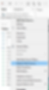
Open the workbook and go to any sheet and add a new data source.

We're going to replace the original data source with our prep output, but first we need to make some changes to ensure a smooth swap. In the original data source, the Line Index field, X, and Y are all in the Dimensions section. We're going drag these fields over in our new data source.


Now you'll replace the data source:

All of the calculations will transfer over, and your chart is ready!

I hope you are able to make use of this Prep template! If you'd like to learn how it was built, check out the video here: Ternary Plot Tableau Prep Template: Put Some Prep in Your Step - YouTube